

Questrade's legacy account selection and account opening experience let users open only one account at a time. Requiring users to fill out the form multiple times was a poor user experience. For mobile devices, the experience was practically non-existent. Questrade wanted to modernize its digital experience.
The existing account selection and account opening experience made Questrade appear outdated. It also discouraged users from opening accounts at Questrade which limited revenue and profit potential.
To modernize the account opening experience, our design team was given a clean slate to design a simple and elegant account opening experience. As a designer on the project, I was responsible for the account selection screen.
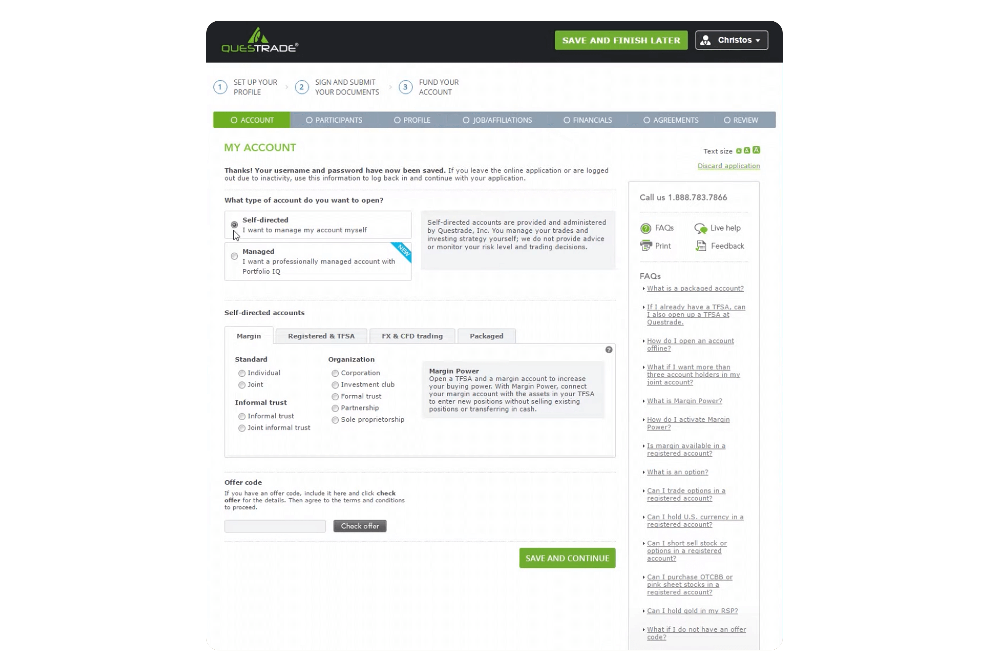
The existing experience was outdated and not user-friendly. The application was:
Questrade's existing account selection experience failed to provide an informative and flexible experience for users who want to open Questrade accounts. Users need to be able to understand the types of accounts offered, and be able to open as many accounts as they would like on any device so that they can start their investing journey at any time.
How might we make Questrade's account offerings and user selections simple and clear?
To begin the redesign, we conducted a survey of 99 Questrade clients and 20 non-Questrade clients about their familiarity with personal finance terms. We found participants were more familiar with, self-directed and managed, as well as TFSA, RRSP, and RESP. Most were less familiar with terms like Corporate, Forex, LIF, RIF, LIRA, and Trusts. "Margin," which was a Questrade-named account, was known by Questrade clients.
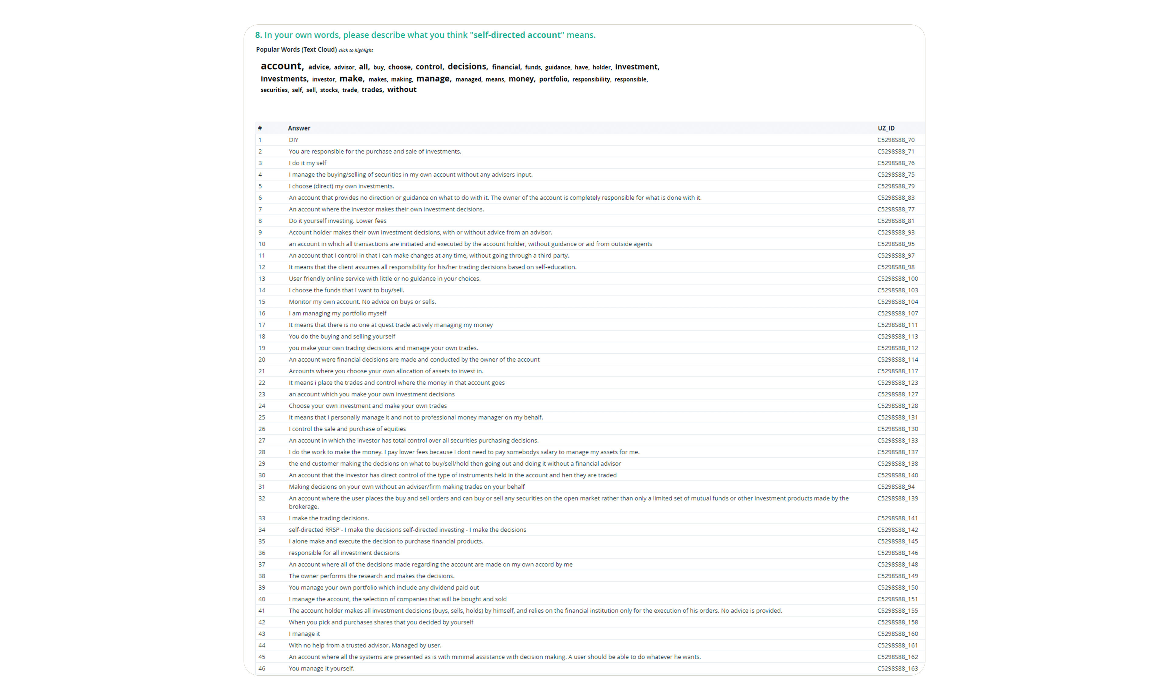
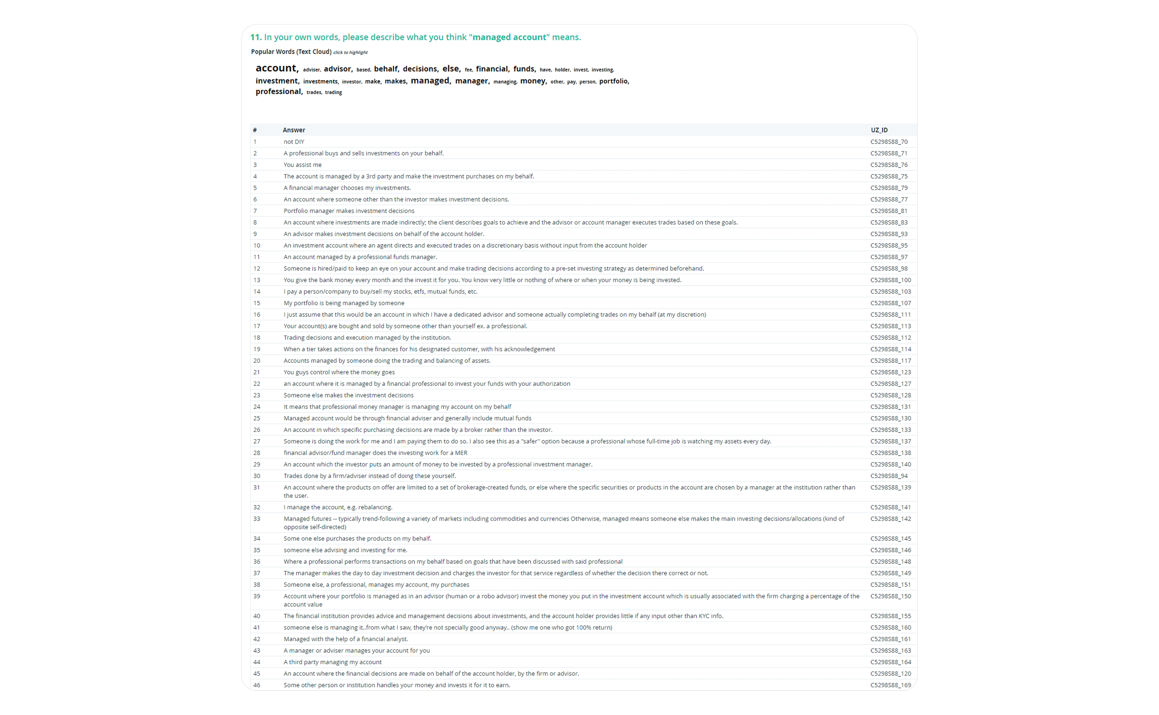
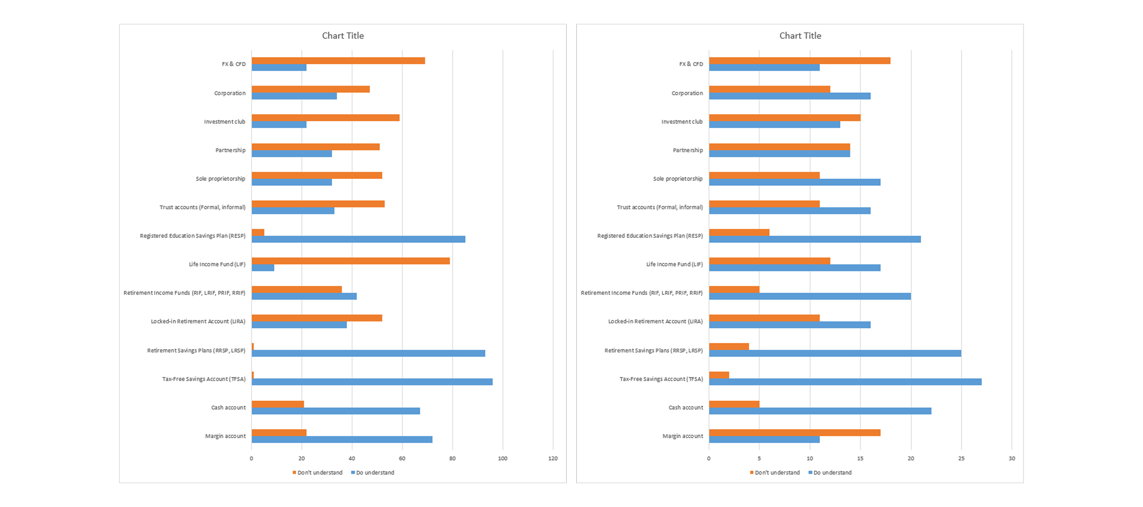
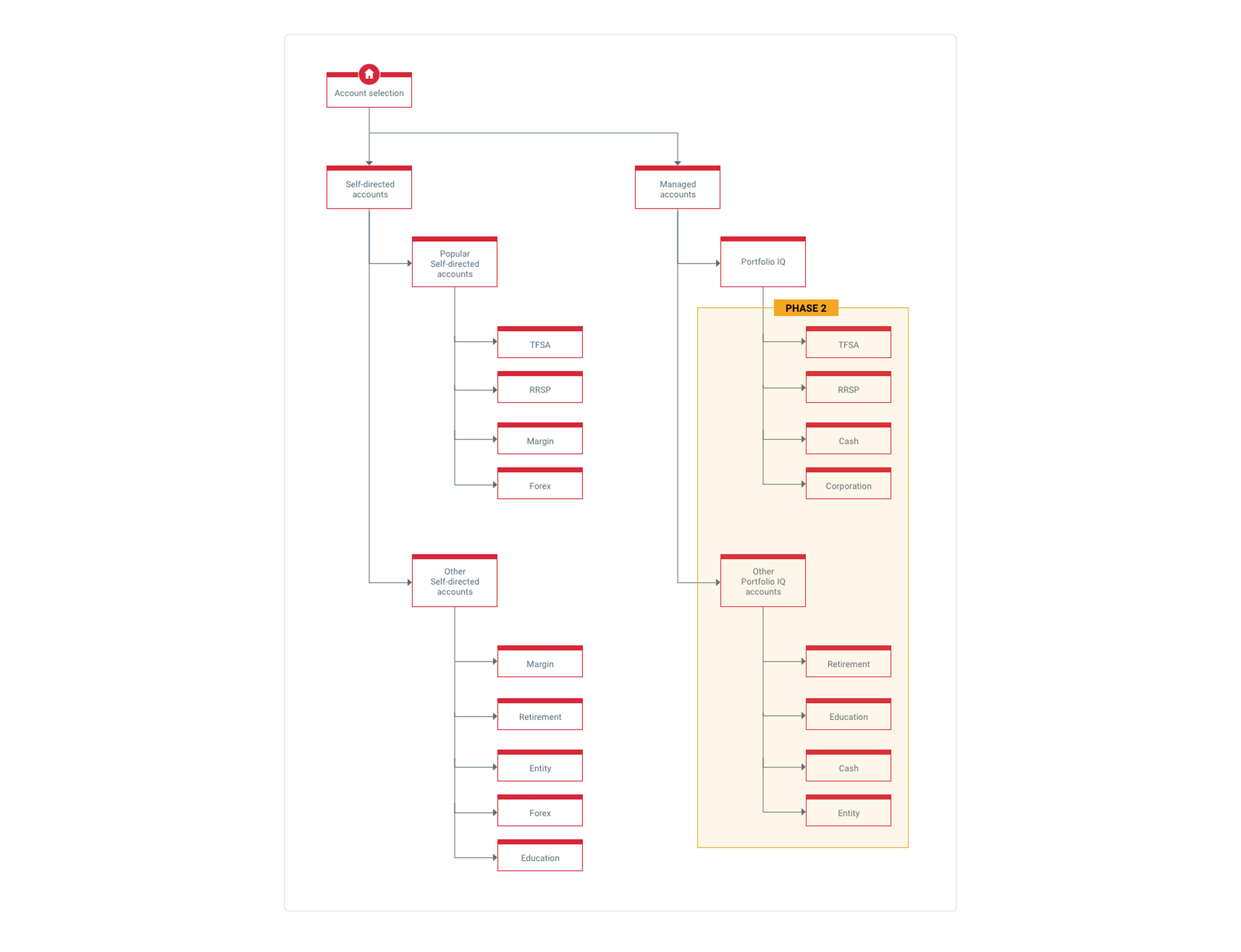
This survey helped us to learn the types of accounts that were popular as well as the less popular and less used, and categorize them. As a result, we used this research to drive the information architecture for the screen.
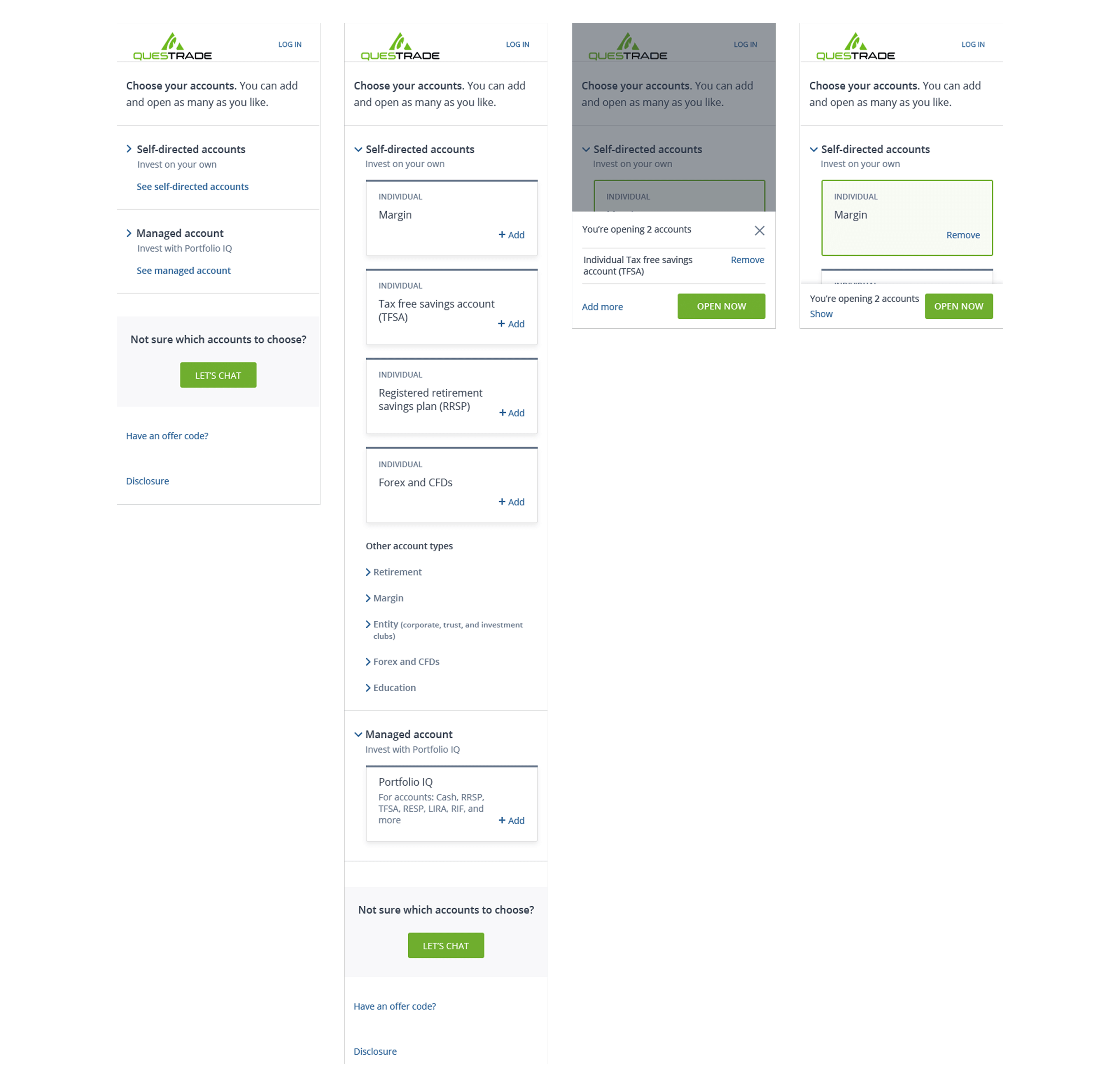
Designing for mobile first let us tackle user interfaces issues that would come up on smaller screens. Issues included reducing clutter and keeping product offerings above the fold.


Internal usability testing showed that participants were unaware they could open multiple accounts, and that the screen had too much copy. So, we simplified the copy, made the product offerings expandable accordions, and inserted a user decision that made adding more accounts a decision point.


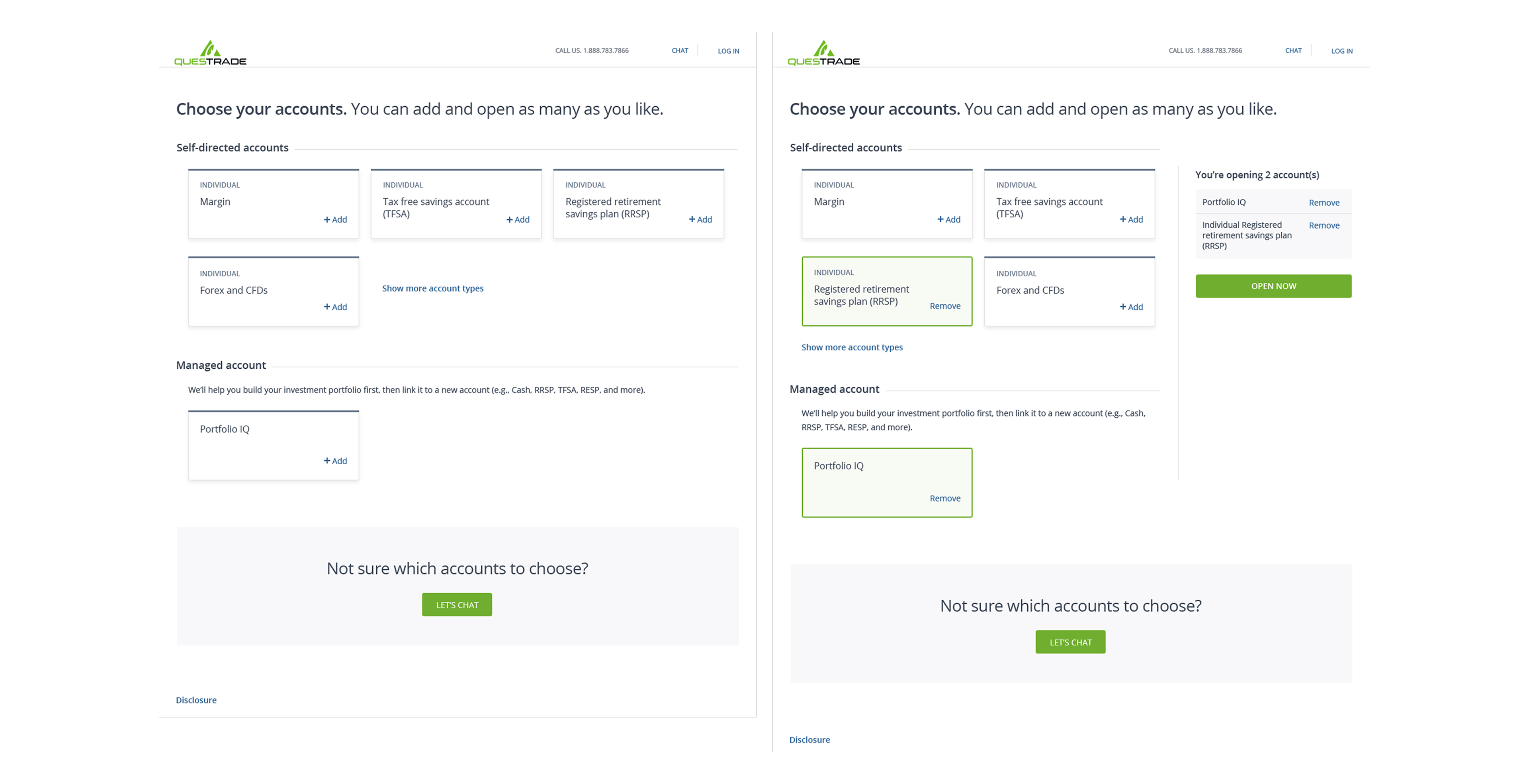
Designing for desktop made us consider user interface issues that could happen with a larger screen, which included featuring popular accounts and also ensuring lesser known accounts were still easily found.


Internal usability testing showed that the "shopping cart" interaction and call-to-action needed to be more obvious, and that the lesser known accounts was too hidden.

For desktop, we made the shopping cart fly in from the right, rather than top or bottom, ensuring a clear action response. We also made the lesser known accounts more discoverable.

To test our iterations, we conducted an in-depth usability study on the full account selection and account opening process with UserZoom participants. The study was featured an unmoderated prototype test along with follow-up questions. The executive summary for the usability test:
Executive summaryDownload full report
This study tested the redesigned client onboarding end-to-end flow: from account selection to account
setup. We tested 31 Canadians, aged 25 – 74, who stated that they have experience in trading and/or
investing. This study had two objectives.
Objective 1: To understand if the account selection experience is intuitive.
We asked participants to explore and select accounts and to remove unwanted accounts.
Our findings:
• A majority of participants knew how to add and remove accounts from their selections and that
they could add multiple accounts at once.
• However, not everyone explored other account types.
• Overall, participants felt the screen was easy, clear, and simple, and some participants
expressed that having account descriptions would be useful.
Objective 2: To discover and understand if the entire end-to-end flow is cohesive and continuous.
We asked participants to start and complete account application on their own.
Our findings:
• A majority of participants successfully created a user ID, filled out their profile information, and
funded an account.
• Many participants expressed that while the process was long and tedious, it was also easy and
straight forward.
• Some participants dropped off from the end-to-end because of technical issues outside of our
control or due to testing fatigue.
Overall the redesigned onboarding experience works, because users are able to select and setup
accounts and progress easily from step to step. We identified two main areas of improvement, which we
want to continue monitoring: other account types and the profile to account setup transition.
I paired with a visual designer to give the solution a splash of colour. Together, we defined animations and interaction states.
The new Account Selection screen, along with the new account opening experience, was launched in December 2017. We saw a whopping 20% increase in new accounts opened on mobile—due to added responsive functionality—and a 5% increase on desktop compared to the previous year.