
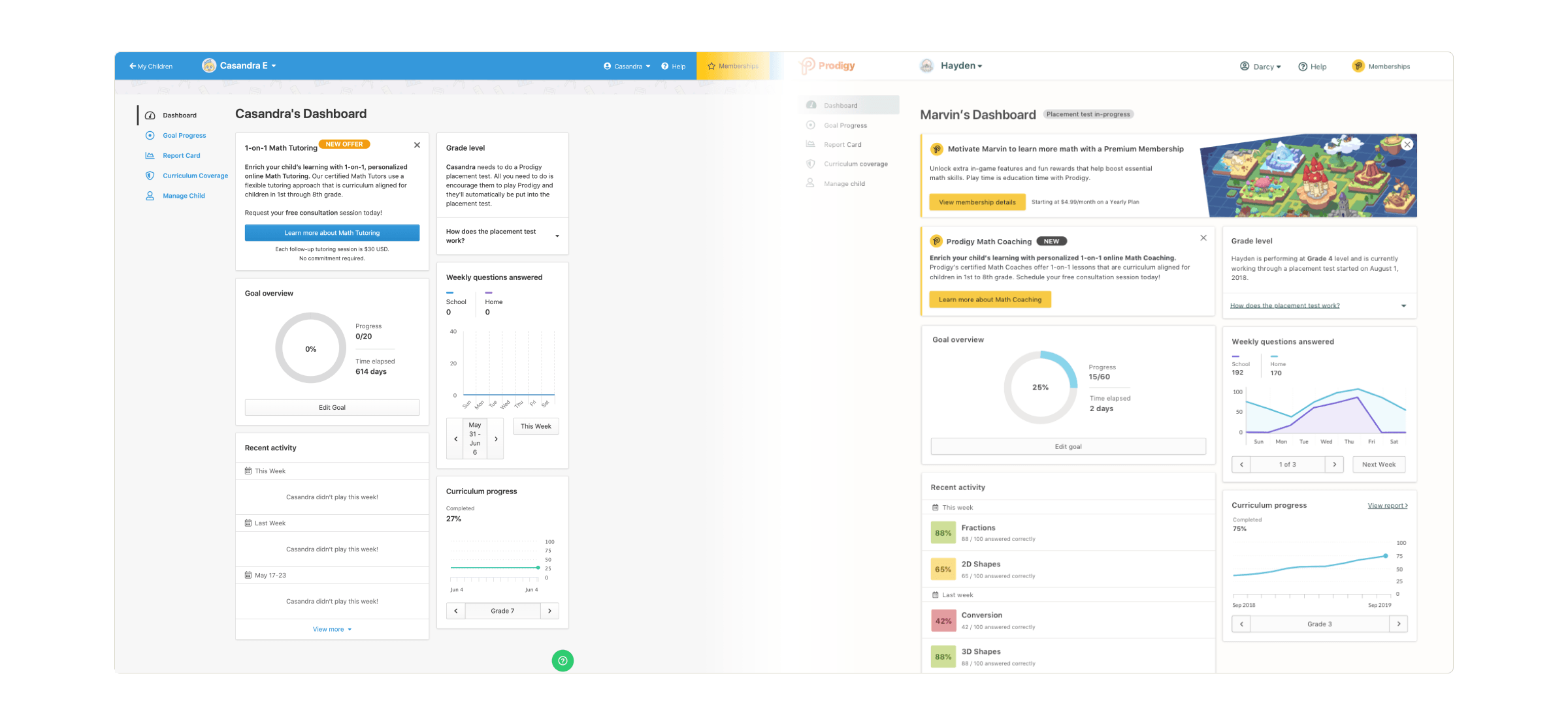
Between 2018 to 2020, Prodigy's design team boomed from four to 13 product designers. Two products grew to five. One office location (Burlington) expanded to two (Toronto). Thousands of educators and parents used Prodigy around the world. But Prodigy's design practice struggled to mature with the team's growth. Design standards were silo'd; Prodigy web apps evolved to look and feel inconsistent from each other. And designers made design decisions without recognizing design impact on other web apps. As a result, Prodigy's product design language was inconsistent and incoherent.
Prodigy executives hired a design agency to rebrand "Prodigy Game" to become "Prodigy Education". As part of the rebrand, executives wanted a plan from the Director of Design to also rebrand the Prodigy web apps. My Director of Design was put in a tough situation as he lacked the design resources to take on the effort. Having already done some design system, my colleague and I volunteered to bring forward a plan to unify and rebrand the Prodigy web apps.
In a short 3 month window, our goal for the project was (i) to give a fresh coat of paint to Prodigy's web apps and (ii) lay the foundation for a design system, by establishing and using colour design tokens.
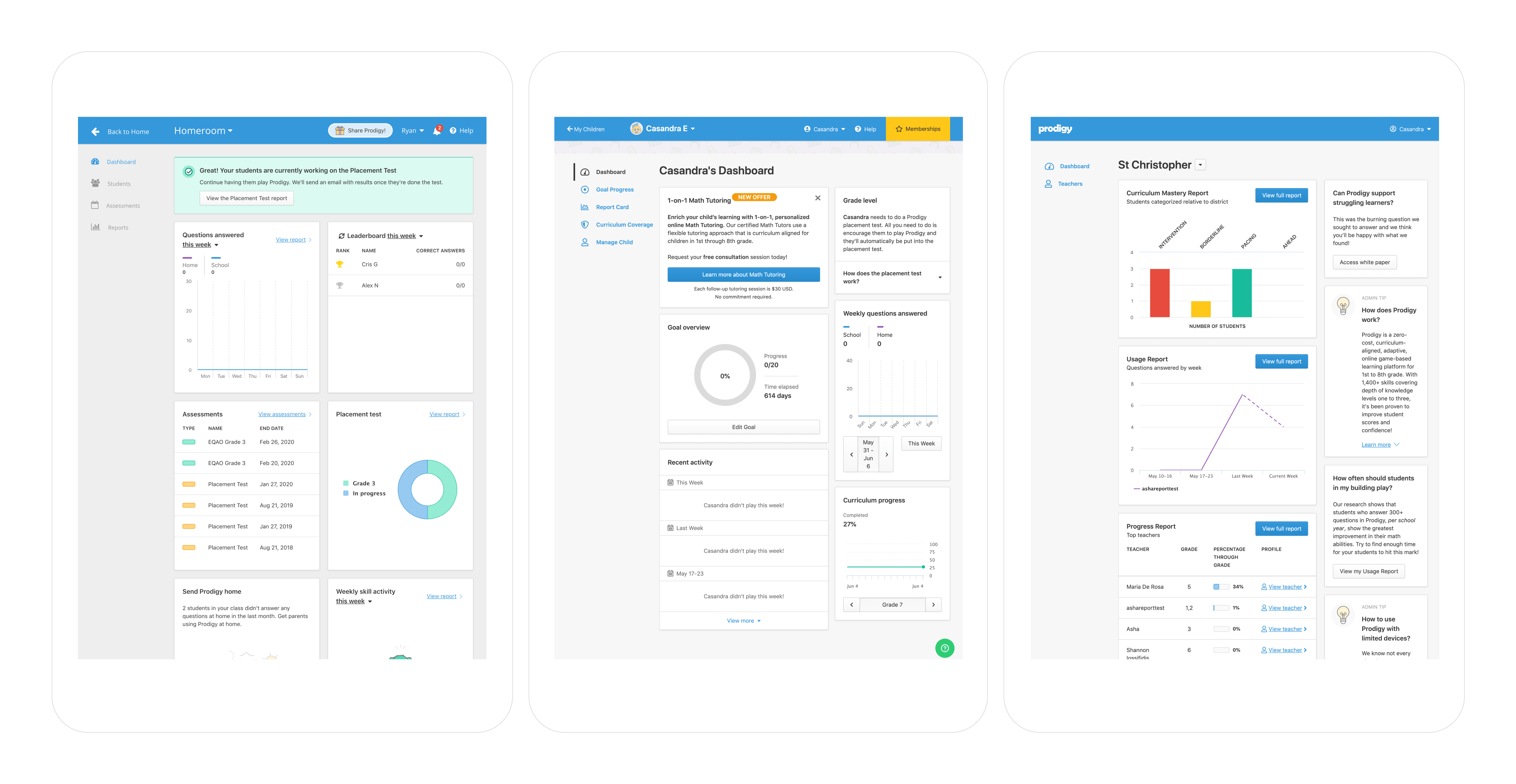
Prodigy's three web apps (2020): Teachers (left), Parents (centre), and Admins
Before starting our work, Prodigy's web apps were plagued with inefficient design and development practices, visual design discrepancies, and a lack of clarity around component usage.

Teachers web app
Product designers couldn't decide if primary action buttons should be blue or green. So, they used both.

Parents web app
Product designers didn't know when primary button colours should be used. So, they used primary colours for non-primary actions.

Admins web app
Product designers didn't have rules for primary button placement. So, they used them any way they wanted.

Inaccessible primary buttons
Primary button colours weren't in compliance with 4.5:1 WCAG AA colour contrast ratio for 14px text.
Our Brand team worked with a design agency to conceive Prodigy's new colour palette. They supplied us with base colours.

Legacy colours

New rebrand colours
We took their base colours, then adapted and expanded them into a full product design colour palette. Colour helped Brand team establish identity, while colour helped Product team with meaningful communication.

Product design colour palette
With our new palette, we explored possible looks and feels to refresh our web apps. We held a design charrette with other designers to get a sense of their visions.

Product colour palette explorations
Users should notice the interface but it shouldn't be overpowering. Most important is the content. Content is king, and the interface shouldn't detract from it.

Final iterations of Teachers (left), Parents (centre), and Admins web apps
We continued iterating towards a unified look and feel for all our products. As the design language came together, we created components and communicated unstated component usage to ensure design standards.

Button state symbols in Figma
Prodigy Education's new design language evolved Prodigy from a game company to an education company. The new visuals featured a softer, matured interface focused on the education content.
Our pattern library and design documentation lay the foundation for evolving Backpack, Prodigy's design system.
We delivered a pattern library built in Figma that let product designers access the same design components. Software developers also used this pattern library to update colours in all our web apps. View library
We created a set of documentation that acted as design guidelines. They were the single source-of-truth outlining design rationale and component usage at Prodigy. View documentation

Colours documentation in Figma
We collaborated with lead software developers and product squads to implement all colour changes. Prodigy's refreshed design language launched on August 4, 2020.
Prodigy's Teachers app with rebrand colours
Following the release, we wanted to continue building our design system. We were planning to work towards:
Our work contributed to: