
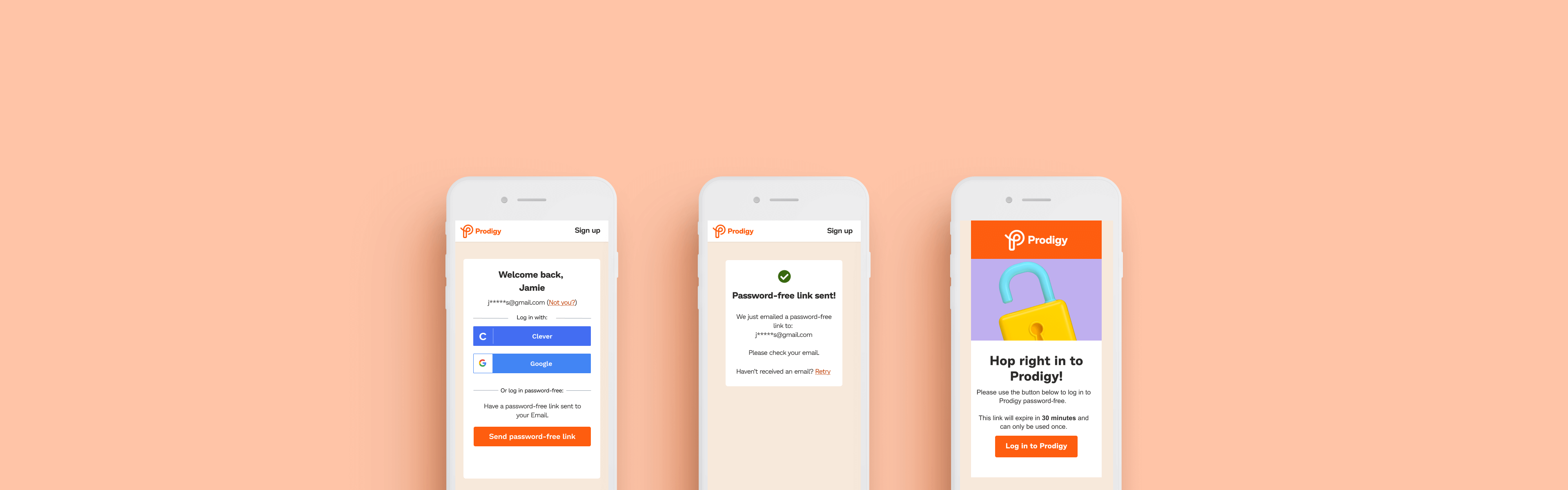
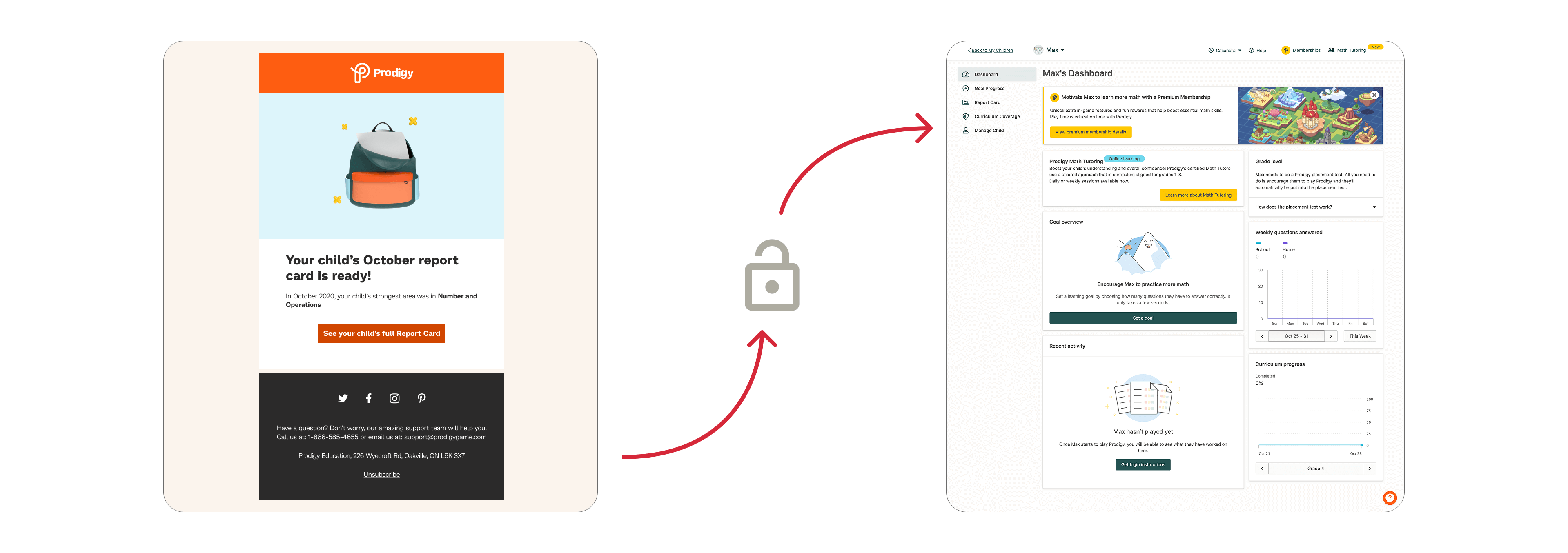
New and existing parents using Prodigy could login to the application completely frictionless using emails containing a non-expiring login token. Parents were conditioned to login like this for years. But letting users login without challenging them was a legacy technical decision that became a prime security concern.
Unsecured emails posed a high-risk security concern. They were non-expiring and they could allow anyone access to the user's account (if shared). As a result, Prodigy users had used these unsecured emails to login to their account for years.
To improve user security, non-expiring logins were to be deprecated. But Prodigy parents were accustomed to logging in with these non-expiring login emails. So, we needed to make logging in this way more secure but still seamless.
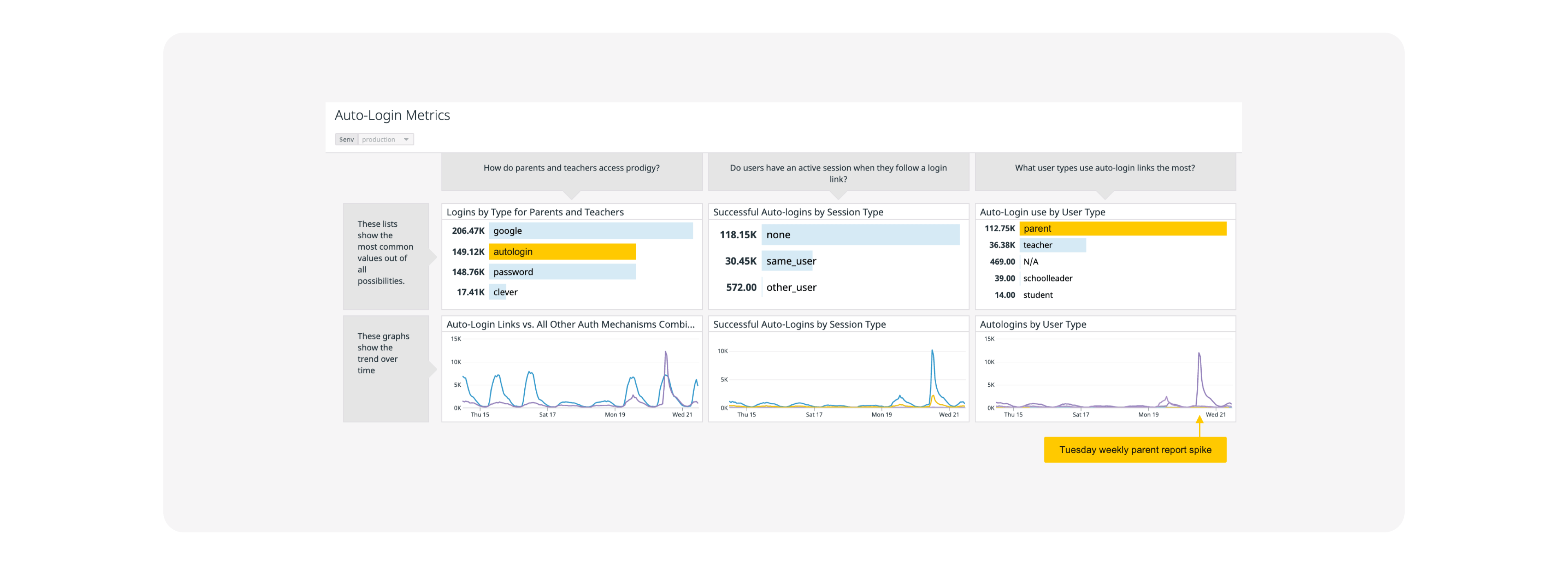
Analytics showed that parents were the majority of user logins, that unsecured emails were a large portion of the login method, and that unsecured email logins spike every week with the weekly parent report email.
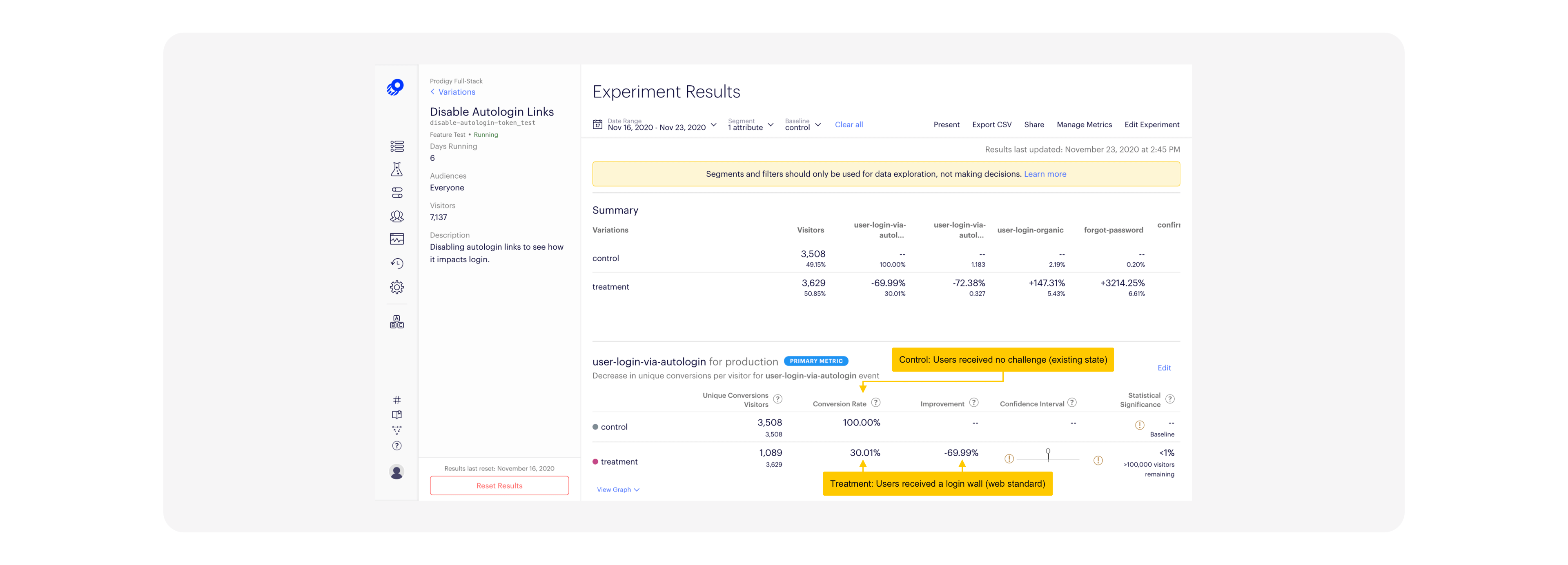
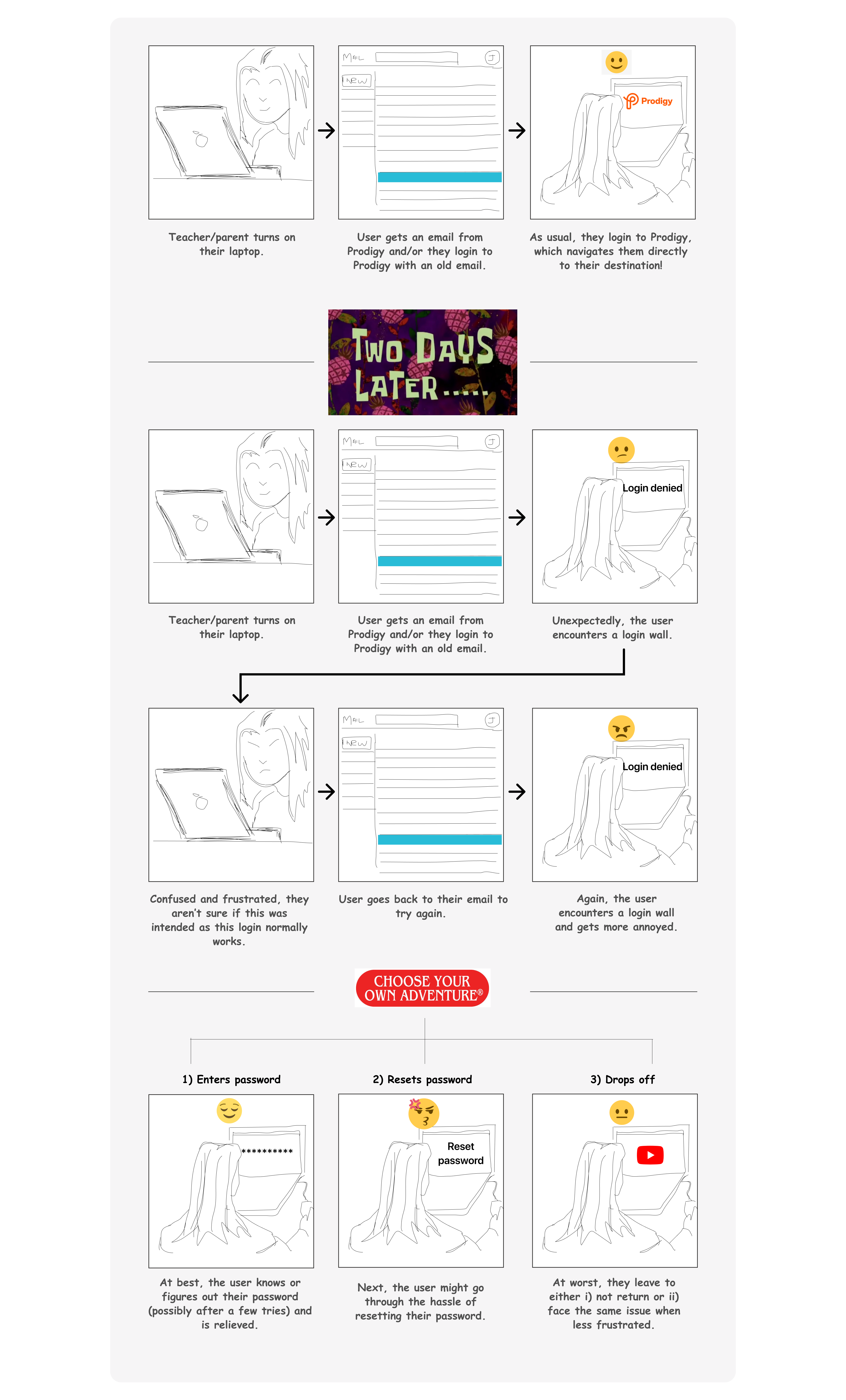
We conducted an AB Test to see how users behaved when receiving a login wall (treatment) versus the existing frictionless experience (control). The result was 70% of users dropped off when challenged with a login wall (only a 30% conversion).
Interviews with parents showed they liked the existing login experience for one main reason: ease. Unsecured emails made it easy for users to log in; easy to access their accounts; easy to assign and check work.
"It’s easy to sign in [to Prodigy] from my phone... and I would find it frustrating to have to type in a password."
"I’d probably still use Prodigy but I’d set a simple password because it’s already hard enough to keep track of my passwords."
"I saved a couple emails that I use to login, just by clicking the button."
"If I had to remember my password, I could see myself using Prodigy less."
During interviews, users disclosed that the main reason they used these emails was to reliably login to their Prodigy Parent app. While there were other reasons such as, to track and assign work and to land them on specific areas, they mainly used them to access the app. So, adding friction to login could cause a decline in app usage.
Prodigy’s use of unsecured emails containing non-expiring login tokens created a significant security risk. While this approach enabled seamless authentication, it also allowed unrestricted account access by anyone in possession of the email. Addressing this vulnerability requires deprecating non-expiring tokens; however, doing so risks increased sign-in friction, which could negatively impact user retention.
How might we keep friction low for parents signing in to Prodigy while increasing security?
Based on the research, new ideas and concepts had to maintain these design considerations to ensure a low-friction user experience:
Remote collaboration sessions and asynchronous collaboration (during a global pandemic) with designers, developers, and product managers on different concepts and user flows.
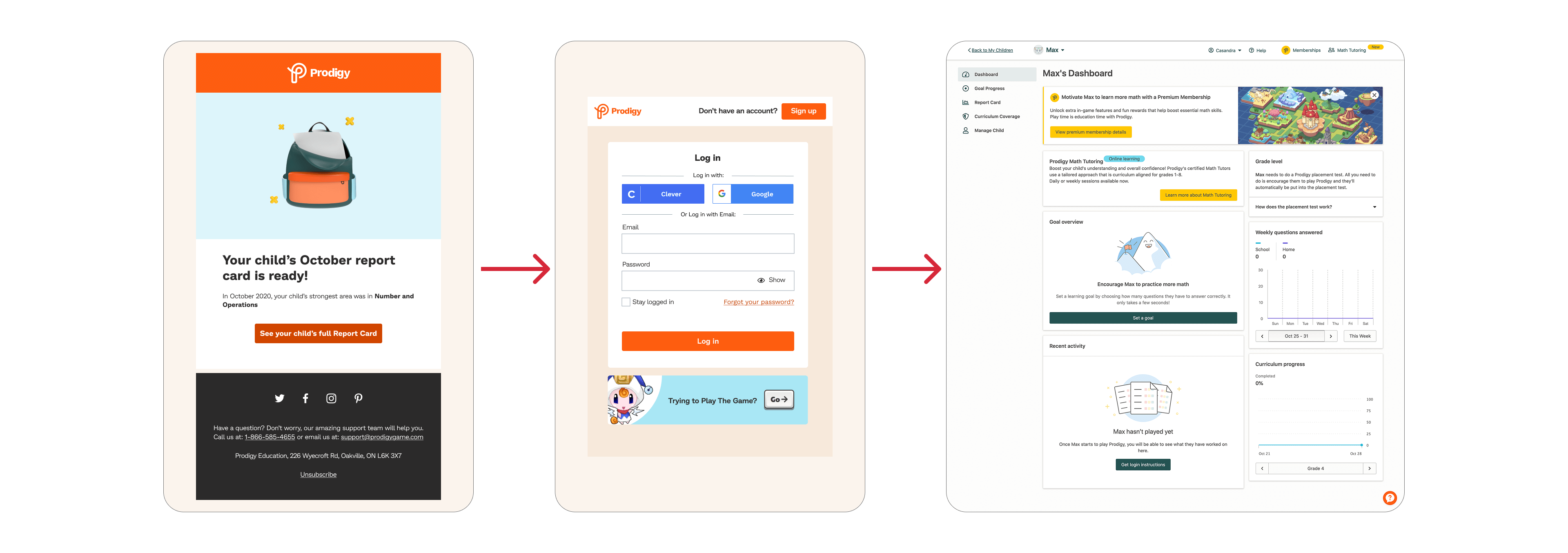
This makes 100% sense. Our Parents have gotten used to instant access. Forgetting their password, resetting it a lot, or giving up is a concern for me.
(All the parents I interview mention that one thing they love about their parent account is how easy it is to get into it from an email. They passively wait for the emails to come to access their accounts and love not having to do any work or remember login info. This is also due to being busy and not navigating to the website to look for how to login on their own - so this solution may work because it points them right to the source).
I feel like this is a more expected experience. I recently tested this solution with about 13 people and everyone understood why they had to log in and didn’t seem to bother them.Are people not using the “Stay logged in”? That seems like it would reduce the friction.
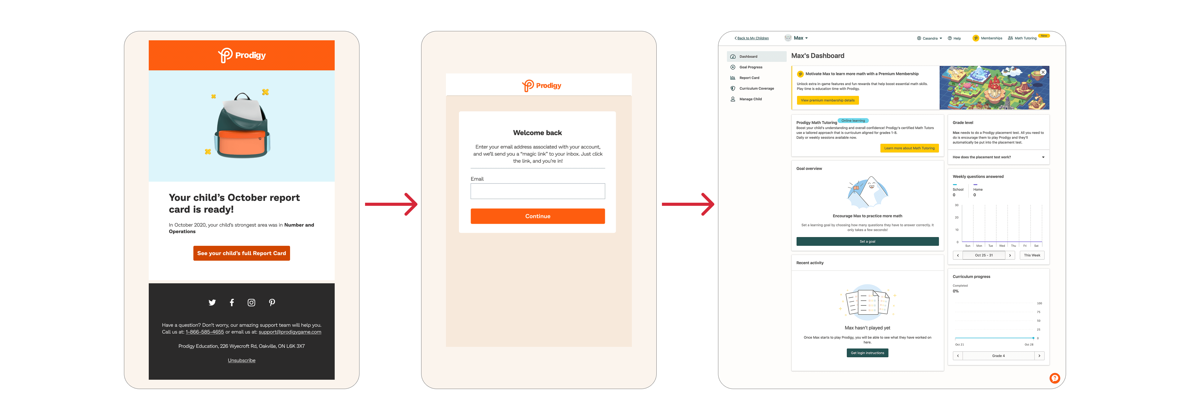
I do prefer magic links as a method to sign in, and I’m wondering if we can reuse that tech/design for any future log in experiences to reduce the friction of credential management.
I like how you used similar ux writing here as I’ve seen on other magic link emails. If anything, have we explored not having parents input their email again? I’m assuming it would be the same email address. We can look into just showing their email pre-populated and the “continue” button. Should the CTA be more tied to the action of getting a magic link sent to you? Instead of “Continue” maybe “Send link now”?
Why magic links? Our team decided it was the best design and development solution because:
I explored different login screen looks that incorporated magic links.
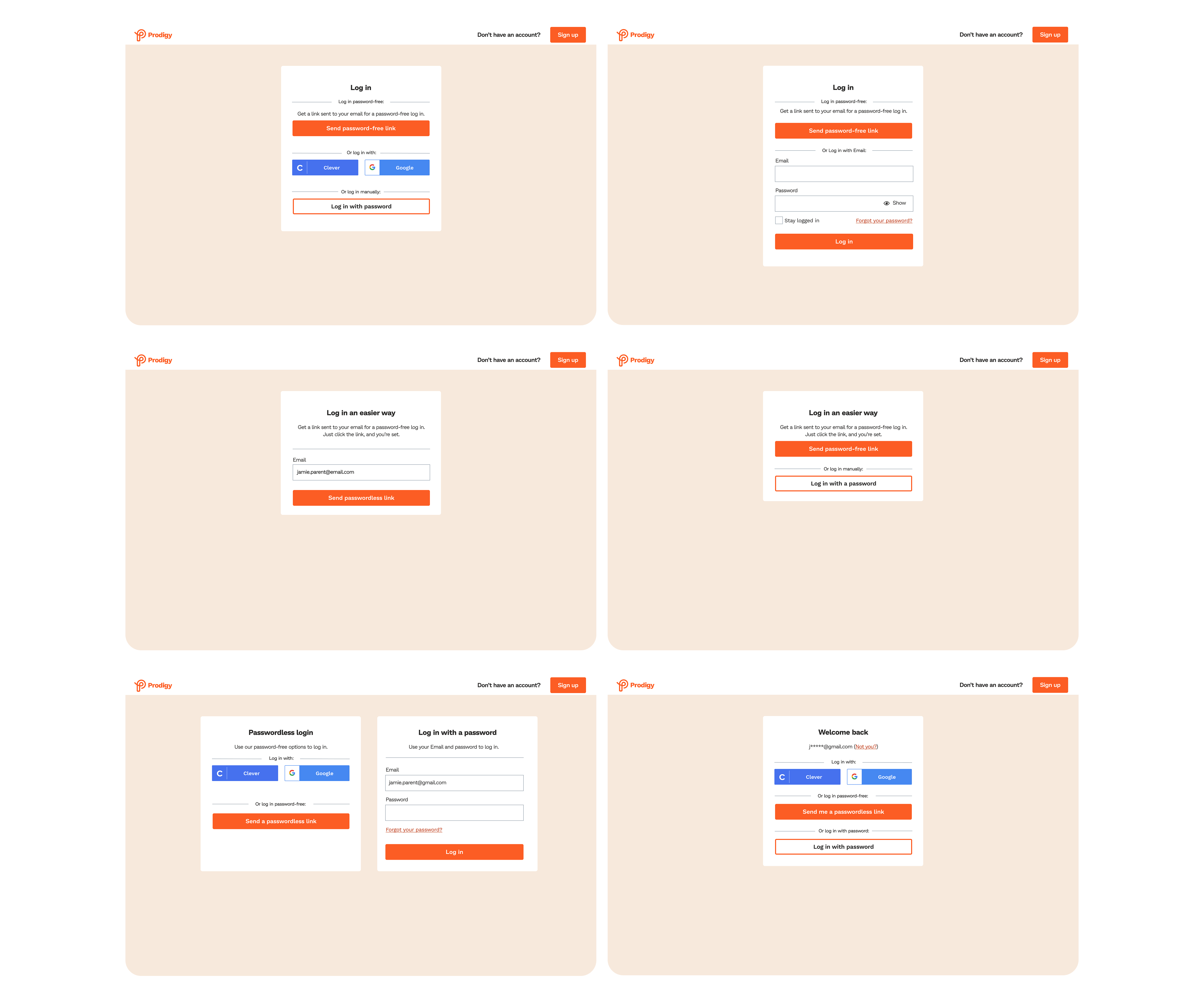
We built a prototype to conduct usability testing with Prodigy parents who were accustomed to the unsecured email flow.
With the prototype, we conducted and gathered qualitative and quantitative data about our proposed magic links experience with Prodigy users. View prototype
We tested these criteria:
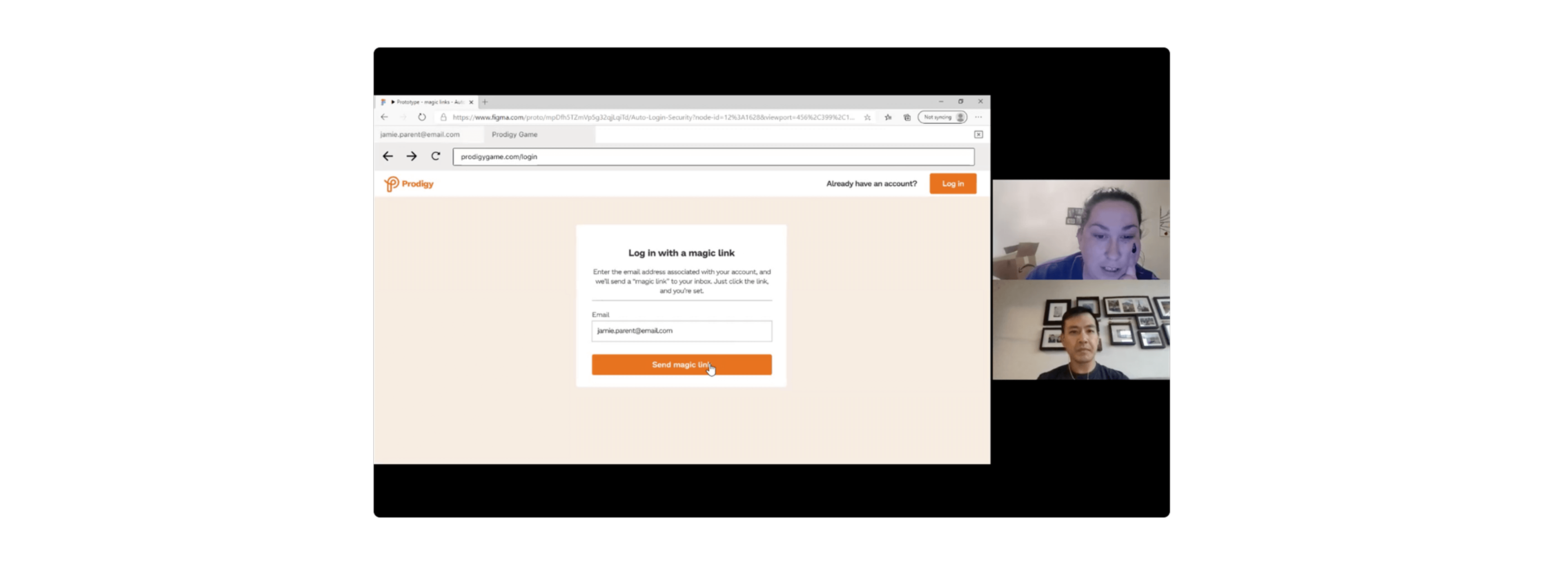
Key changes due to testing:
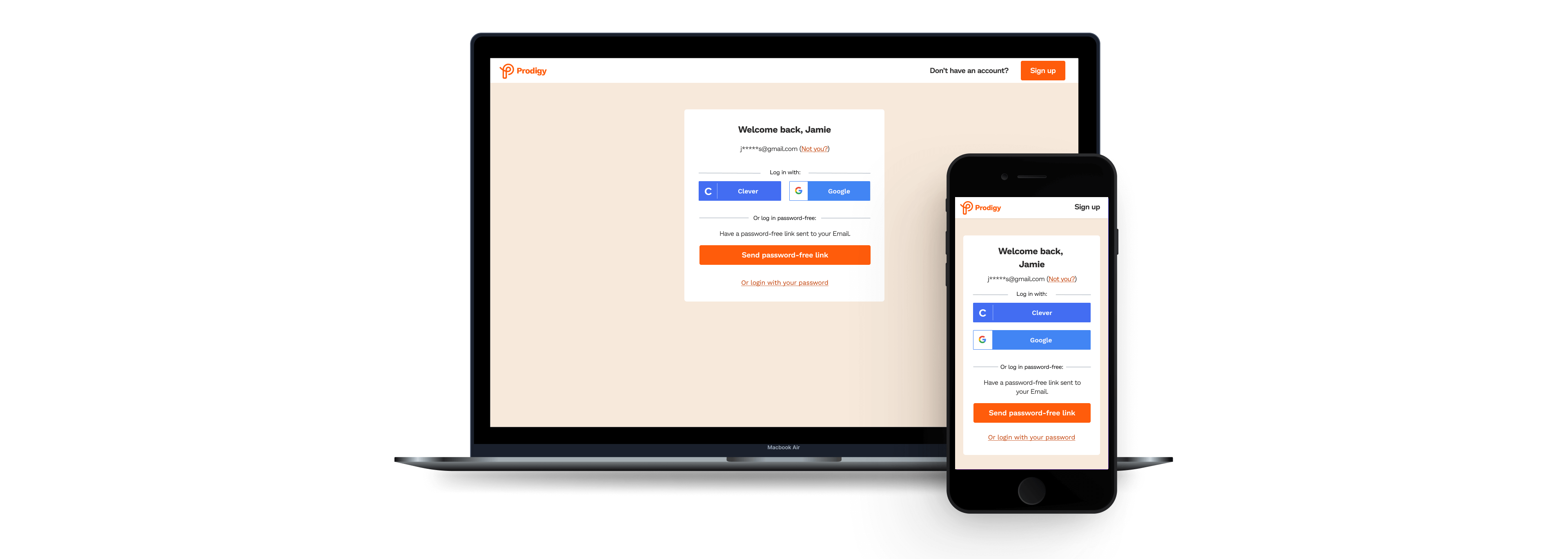
Our magic links solution had a new login screen and user flow that replaced the existing login experience with a more secure authentication process.
We tracked these metrics to determine success of the feature:
Magic links was released in January 2021. But I had left Prodigy before the release. The demo (below) was recorded from Prodigy's live website in July 2025.